The best logos are rarely the most complicated ones. Think of the marks you recognize in half a second, on a phone screen, a shop window or a delivery van. They are simple, confident and consistent. A strong logo does not explain everything about a business. It gives people one clear, memorable signal, and the rest of the brand builds the story around it.
Start With Strategy, Not Sketches
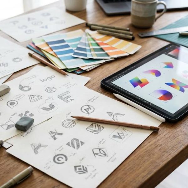
Before opening any design software, answer a few plain questions. Who are your customers? What do you want them to feel when they see your name? How are you different from competitors? A logo that comes from clear answers has direction. A logo that comes from taste alone often looks nice and says nothing.
Write three words that describe your brand, such as friendly, precise and modern. Keep them in front of you during every design decision.
Keep the Idea Simple
Simple marks are easier to recognize and easier to reproduce. Too many details turn into a blur when the logo is small, printed on a pen or shown as a tiny icon in a browser tab. A good test is to shrink your design to the size of a fingernail and see whether it still reads clearly.
If a logo cannot be recognized at a glance and drawn from memory, it is probably too complicated. Remove one element at a time until removing another would break the idea.
Choose Shapes and Color With Purpose
Shapes carry feelings. Circles suggest community and movement, squares feel stable and trustworthy, and sharp angles feel energetic. Color works in a similar way, and meanings change from culture to culture. Blue often signals trust, green suggests growth, and red draws attention quickly. Limit yourself to two or three colors, and make sure the logo still works in black and white.
Pick Typography Carefully
Letters do a large part of the work in most logos. Choose a typeface that matches the personality of the brand and stays readable at small sizes. A serif font can feel traditional and serious, while a clean sans serif feels modern and open. Avoid decorative fonts that look clever today and awkward in a few years, and check that the letter spacing looks even.
Design a Flexible System
One logo file is never enough. You will need a horizontal version for websites, a stacked version for social media profiles, a compact icon for apps and a single color version for stamps and engraving. Plan these versions from the beginning, along with clear rules about the space that must be left around the mark.
Test in Real Situations
Place your logo on mockups of business cards, packaging, a website header and a dark background. Look at it on a phone screen in sunlight. Ask a few people who know nothing about your business what the logo suggests to them. Their first reaction is often more honest and more useful than hours of discussion inside the team.
Avoid Trends That Age Fast
Gradients, glows and fashionable effects can make a logo feel fresh for a year and tired for the next ten. Timeless marks usually rely on strong shapes and clear proportions. You can refresh the surrounding brand with seasonal visuals while keeping the core mark steady.
Check Originality and Protect It
Before you fall in love with a design, make sure it is not too close to an existing mark in your field. Search trademark databases and image results, and think about registering your logo once you are sure about it. The World Intellectual Property Organization guide to trademarks explains how brand names and logos are protected around the world.
Write Simple Brand Guidelines
A short guide keeps everyone consistent. Include approved colors, fonts, minimum sizes, spacing rules and examples of what not to do, such as stretching or recoloring the logo. Even a two page document saves arguments and keeps your brand looking professional across printers, designers and partners.
Think Globally From the Start
If you plan to sell abroad, check how your name and symbol are understood in other languages and cultures. Scandinavian brands are a good example, because their clean visual style travels well, yet their names and slogans still need careful adaptation. Companies that enter Nordic markets often turn to Swedish translation services to adapt slogans, packaging text and product descriptions so they sound natural to local customers.
Even famous companies have stumbled here. This article on global brand localization fails shows how a name or slogan that works at home can confuse or embarrass a brand overseas.
Let the Brand Grow Over Time
A logo becomes memorable through repetition. Use it the same way on every website, invoice and package, and give people time to learn it. Review the design every few years, make small improvements when needed and resist the urge to start from zero every time someone gets bored. Consistency beats novelty in the long run.