A logo is often the first thing people notice about a business. A strong one is simple, flexible and easy to remember. This guide explains the main principles of logo design and shows how to build a visual identity that works across products, screens and countries.
Start With Your Brand Story
Before drawing anything, define who you are, what you do and how you want people to feel. A logo should express this story in a single glance.
Keep It Simple
The most famous logos use few shapes and colors. Simplicity makes a mark easy to recognise and to remember.
Make It Memorable
Aim for a unique shape or idea that stands out from competitors. A clever detail can help, but it should never confuse the message.
Choose Colors With Purpose
Colors carry meaning, such as trust in blue or energy in orange. Select a small palette that suits your audience and your values.
Pick Typography Carefully
Letter shapes express personality, from classic serif to modern sans serif. Choose readable fonts and avoid mixing too many styles.
Ensure It Scales
A logo must look good on a tiny icon and on a large sign. Test small sizes early, and simplify details that disappear.
Design for Black and White
A strong mark works without color. This helps with print, stamps and low cost materials.
Create Flexible Versions
Prepare horizontal, stacked and icon only versions. Different spaces need different layouts.
Respect Clear Space
Leave empty room around the logo so it can breathe. Clear rules prevent crowding and keep it visible.
Study Inspiration Sources
Design organisations publish case studies and guidance. The Design Council shares research and examples that show how good design supports business.
Sketch Many Ideas First
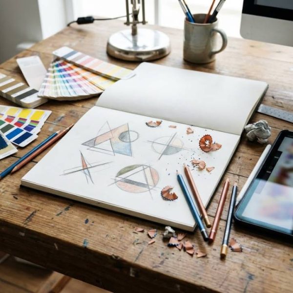
Draw dozens of rough concepts before opening software. Quantity leads to better quality choices.
Test With Real People
Show your options to customers and colleagues. Ask what they see, feel and remember after a few seconds.
Avoid Trends That Age Quickly
Fashionable effects can look dated within a few years. Timeless forms last longer and save redesign costs.
Check for Originality
Search existing logos and trademarks to avoid similarities. Originality protects your brand and your budget.
Think About Cultural Meaning
Symbols, colors and words can mean different things abroad. Research each market before launching a new identity.
Prepare for International Growth
When you enter new countries, names and slogans may need adaptation. Learning from global brand localization fails helps you avoid costly embarrassments.
Support Brand Voice in Other Languages
A strong identity includes tone and wording, not only visuals. Clear taglines and product text created with French translation services help a brand sound consistent in France and other French speaking markets.
Build a Brand Guide
Document logo rules, colors, fonts and tone in one place. A guide keeps designers, printers and partners consistent.
Apply the Logo Everywhere
Use it on websites, packaging, uniforms and social profiles. Consistent use builds recognition over time.
Plan Social Media Formats
Profile pictures are small and often round. Prepare a version that stays clear inside these shapes.
Prepare Files Properly
Keep vector files for print and web ready images for screens. Name files clearly for easy sharing.
Protect Your Identity
Consider registering your logo as a trademark. Legal protection helps prevent copying.
Refresh Rather Than Replace
If a logo needs updating, evolve it gradually. Small changes keep recognition while modernising the look.
Measure Brand Recognition
Surveys and feedback show whether people remember your mark. Use results to guide future decisions.
Hire the Right Designer
Review portfolios and ask about process. Good designers listen first and explain their choices clearly.
Set a Clear Brief
Share goals, audience, competitors and examples you like. A good brief saves time and improves results.
Allow Time for Feedback
Branding needs reflection. Plan rounds of review and give specific comments about what works and what does not.
Stay Consistent Over Time
Consistent use of your identity builds trust. Resist changing it every season.
Keep Learning About Design
Trends, tools and audiences change. Follow design blogs and case studies to keep your skills fresh.
Use Mockups for Testing
Place your logo on cards, signs and screens before finalising. Mockups show how it looks in real situations.
Check Accessibility
Make sure text and symbols have enough contrast. People with color vision differences should still read your brand clearly.
Consider Motion and Animation
Logos may appear in videos and apps. Plan simple animation that keeps the shape recognisable.
Keep Source Files Safe
Store original design files and fonts in a secure place. Lost files make later updates slow and expensive.
Respect Licensing Rules
Check that fonts and images have proper licences for commercial use. Legal problems can force an expensive redesign.
Share the Story Behind the Mark
Explain what your logo means on your website and in presentations. A story gives people a reason to remember it.
Ask for Honest Feedback
Invite criticism from customers and partners. Thoughtful comments reveal issues you cannot see yourself.
Plan for the Long Term
Think about how the identity will look in five or ten years. Solid foundations reduce the need for drastic changes.
Final Thoughts
A great logo is simple, flexible and rooted in a clear brand story. Test your ideas, document your rules and think about every market you plan to enter. With patience and care, your identity will become a trusted signal wherever people meet your brand.